CG Windows Branding
CG Windows is a Vancouver-based company specializing in premium, energy-efficient window solutions for residential and commercial projects. The brand identity and website were designed to reflect the company’s commitment to quality, precision, and superior craftsmanship while positioning CG Windows as a modern, trusted leader in its market.
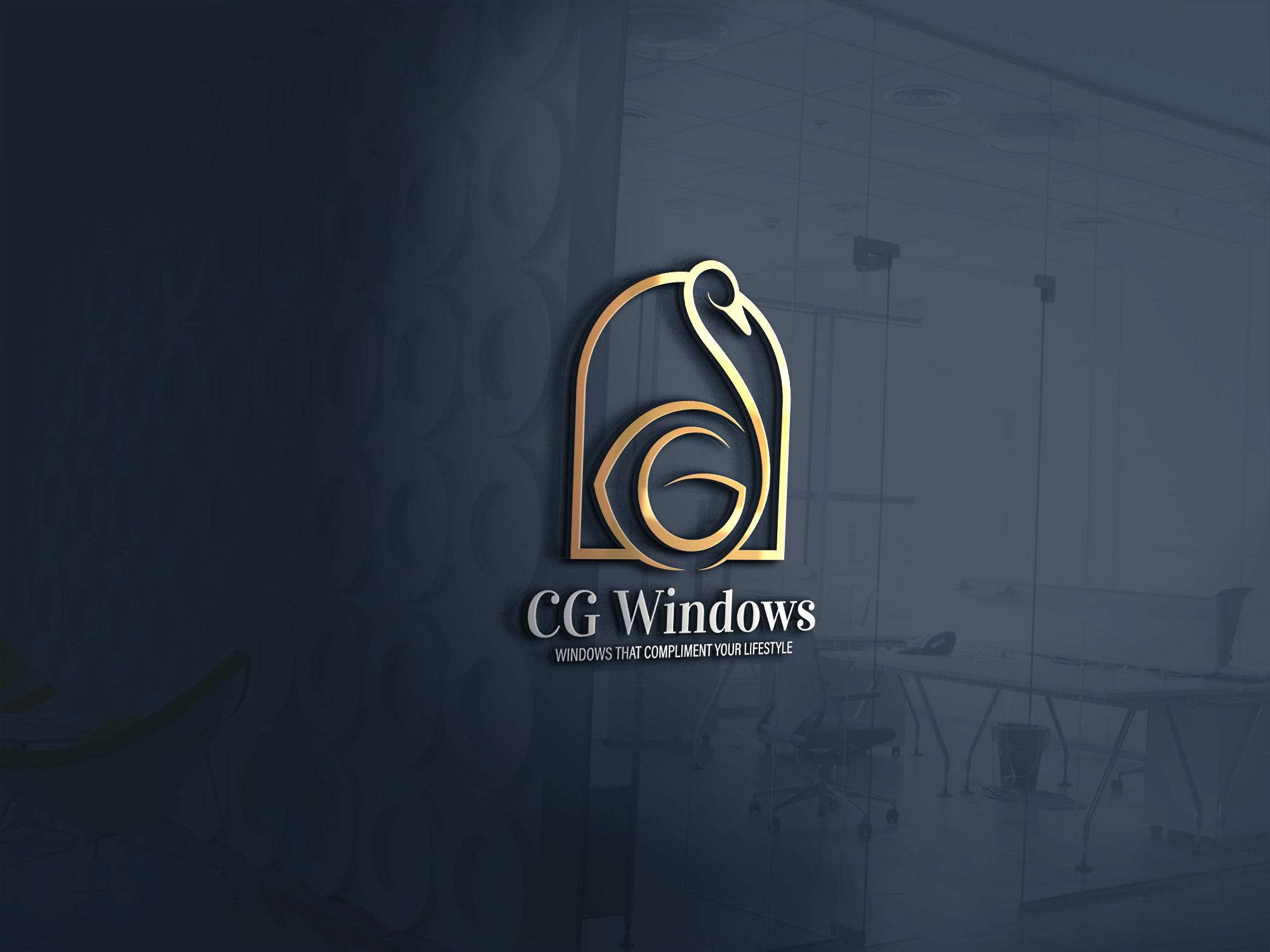
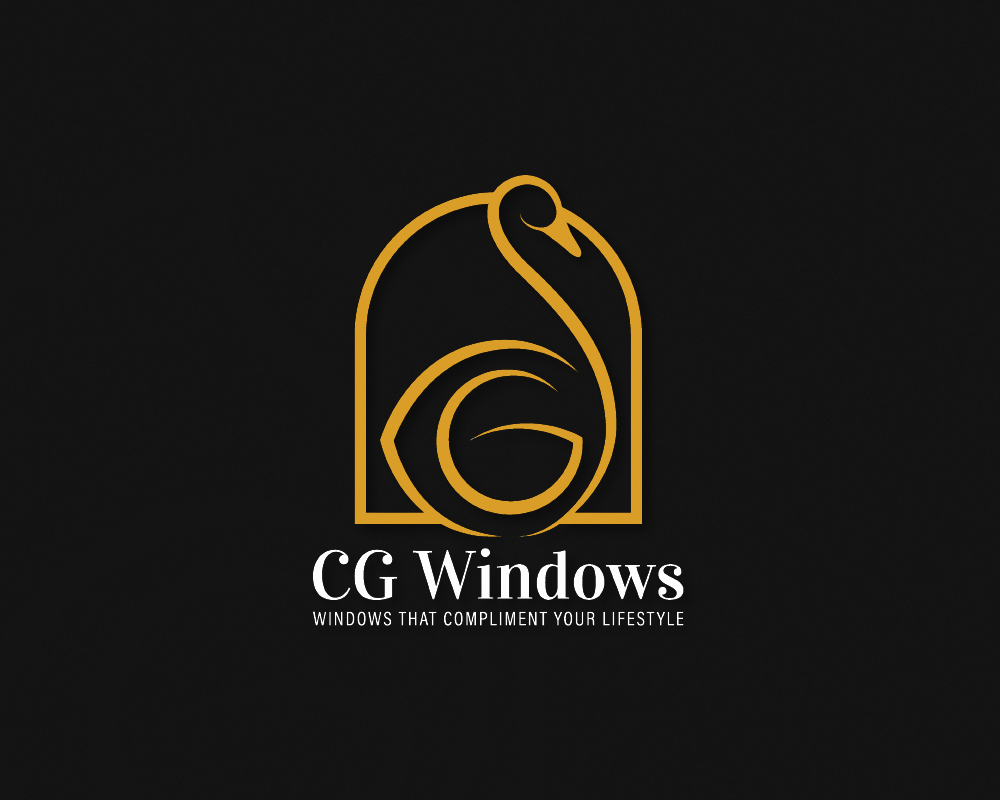
The logo design centers on a distinctive and meaningful visual mark. The company’s initials, C and G, are thoughtfully integrated with the form of a swan—CG Windows’ symbolic emblem representing elegance, trust, and refinement. These elements are framed within a window structure, directly referencing the company’s core product while reinforcing ideas of strength, durability, and architectural precision. A clean, modern visual language ensures the logo feels both timeless and contemporary, with strong versatility across digital and physical applications such as signage, vehicles, and marketing materials.
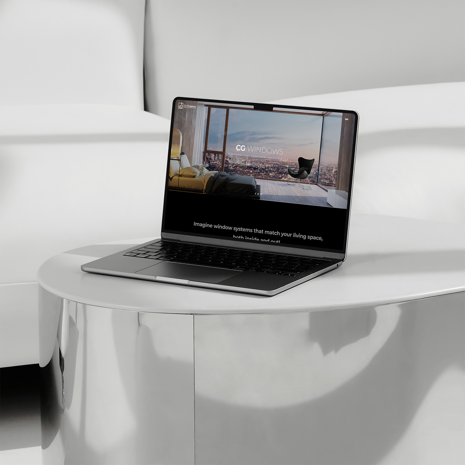
The website design extends this visual identity into a refined digital experience. Fully responsive across desktop, tablet, and mobile devices, the site allows users to easily explore CG Windows’ services and completed projects. Parallax scrolling effects add depth and visual impact, enhancing the storytelling while maintaining clarity and usability. A structured layout, strong typography, and clear content hierarchy guide visitors through the site, while project showcases and service sections build trust and credibility.
Together, the logo and website create a cohesive brand presence that balances elegance, innovation, and functionality—effectively communicating CG Windows’ expertise and supporting the company’s continued growth in the Vancouver market.
Client::
CG Windows
Location::
Vancouver, Canada
Date:
January 4, 2022